


Today we’d like to introduce you to Christopher Laubenthal.
Christopher, we appreciate you taking the time to share your story with us today. Where does your story begin?
I moved to Kansas City two decades ago, after completing my Master’s in Public Administration at Ohio State University. At Ohio State, I discovered a gift for visualizing data—helping people understand abstract concepts and complex information. Coming to Kansas City, I was determined to continue working with data even if indirectly.
I started as a government contractor for the Department of Homeland Security, completing public records requests. From there, I served as an Education Coordinator for the University of Missouri-Kansas City’s Continuing Medical Education team. I completed research on speaker efficacy, designed our event registration interface, and coordinated many events.
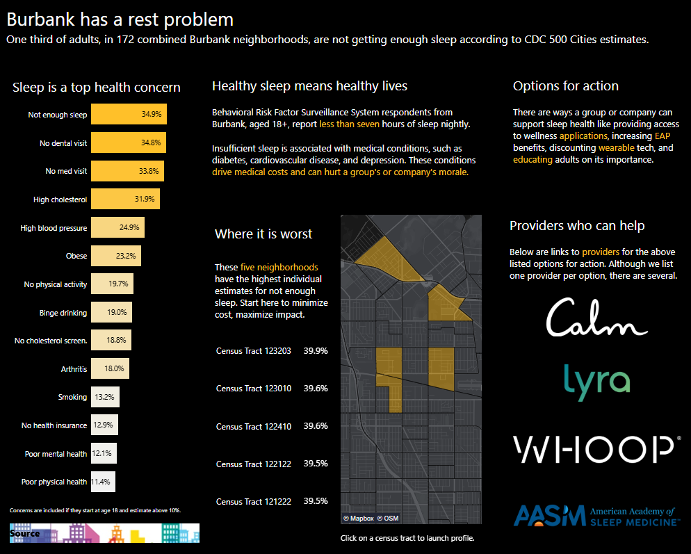
Then came my big break. The Ewing Marion Kauffman Foundation (EMKF) took me on as their first Senior Data Analyst. Over the next five years, I built a data visualization solution that we took from a preliminary investment to half a million in grants. Its name was EdWise. This tool took publicly available education data from Kansas and Missouri and made it accessible through interactive charts. EdWise was used to solve labor disputes, shared with Senators, and showed how ahead of the curve EMKF continues to be.
From there, I would enter the private sector for another five years. My focus was to generate sustainable data solutions that helped clients, while raising data literacy organization-wide. Yet, I knew the private sector was not a perfect fit for me as I felt the pull to enter back into non-profit work. My first call was to Leigh Anne Taylor Knight of The DeBruce Foundation (DBF). She is a friend and a mentor. Leigh Anne saw an opportunity to build out robust reporting internally and interactive storytelling externally. The kind of charts, slides, and dashboards that help people of all backgrounds understand the economic opportunity found in DBF’s work.
Alright, so let’s dig a little deeper into the story – has it been an easy path overall and if not, what were the challenges you’ve had to overcome?
Data visualization work has been around as long as maps have been; jobs in data visualization have become viable in the past eight or nine years. More than once, the books I required did not exist. Due to that lack of public awareness, one of the hardest parts of my work has been explaining why having an expert in data visualization was a viable business need.
This is the price of innovation; the first step is always education. Building out a career this way was not an easy process, but it made me an effective educator. It taught me to focus on the needs of the client above all else and how to be accessible. Since then, I have made it a goal of mine to support those walking a similar path.
As it turns out, there are many ways to support others and the field of data visualization itself. For me, the work of helping others included joining industry organizations (The Data Visualization Society, The Bar Chart Club), writing articles in an industry publication (The Nightingale), participating in public industry challenges, giving guest lectures with local colleges (Avila and the Kansas City Art Institute), and directly mentoring the next generation of data visualization designers. For me, all this work comes down to connecting with other people, so that they have what they need to be successful.
Thanks for sharing that. So, maybe next you can tell us a bit more about your work?
Data visualization is the act of using an image to represent information. Most people come across data visualizations when they check the weather report and see a rain cloud or watch a baseball game and see a pitch tracker. The core of my work is generating those sorts of images in all kinds of sizes. Sometimes this involves making charts in a spreadsheet program for a slide deck, and other times it means using dedicated software to develop a large, innovative infographic.
I have the pleasure of building these different-sized data visualizations here at The DeBruce Foundation, a nonprofit organization founded in 1988 by civic leader and successful entrepreneur Paul DeBruce. Since its beginning, this organization has focused on improving the lives of others and strengthening our community. Our mission is to expand pathways to economic growth and opportunity. We conduct research and develop career-building resources for people who are choosing and changing careers. Through our work, we aim to help people build empowered careers. For me personally, this mission means helping people not feel limited in the kind of vocational future they would like to build.
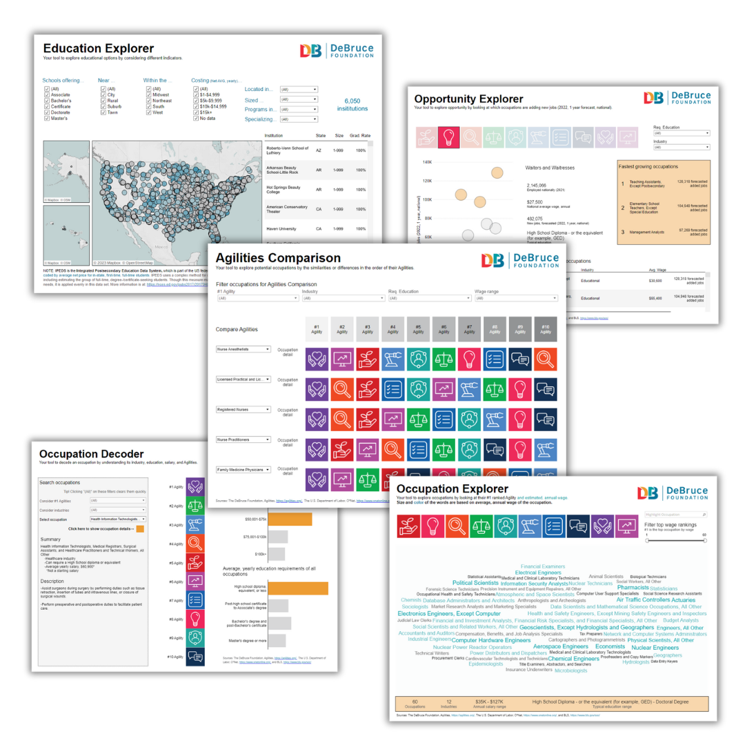
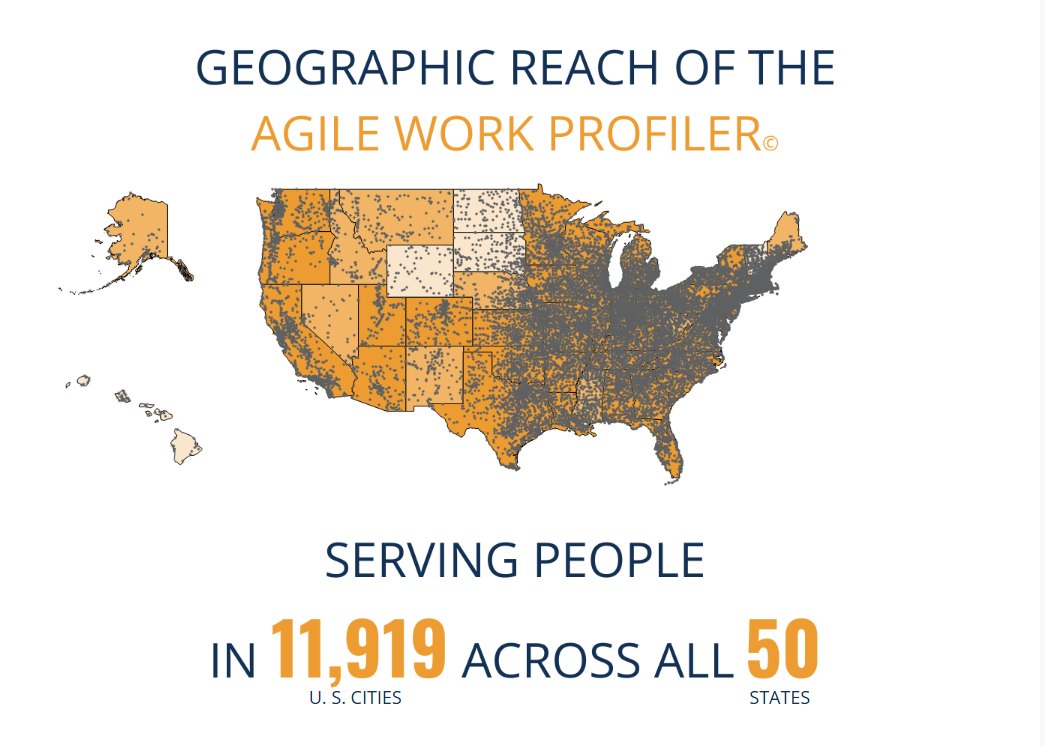
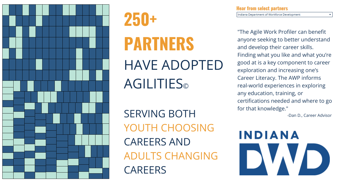
To support this mission, my work has two fronts based on the audience: internal or external. For my internal teammates, I have had the pleasure of creating over 150 reports, with about half of them including additional mobile versions. This means that whether a teammate is on their desktop or using their phone, they have immediate access to what is happening in our work. Teammates can look through data from the impressive 400,000+ uses of the Agile Work Profiler©, our free, online career assessment. They can quickly follow the growth of our geographic footprint or see how our partners are doing.
Though my largest pride point comes from the second front, external-facing data visualizations. The DeBruce Foundation has several online visualizations that help you learn about yourself, support the expansion of economic pathways, and have generated a combined 696k views. Recently, we added to that collection a powerful component when we released Mission Momentum. This long-form data visualization is part report, part infographic, and allows everyone to connect directly with the great work we are doing here. Our concept behind this visualization was to create an experience for our users that lets them interact with and learn from our story. We felt interactivity was an important tool for human connection and innovative in non-profit storytelling. I invite you to explore Mission Momentum at DeBruce.org/mission-momentum
How can people work with you, collaborate with you or support you?
People can reach out to me through LinkedIn, look up my Tableau Public account, or read my writing on The Nightingale. I am always happy to hear from others who want to understand data visualization and would love to explore more public speaking opportunities.
As for The DeBruce Foundation, there are many ways to connect with us and join in our mission!
I invite you to take the Agile Work Profiler©, our free, online career assessment, to learn more about your own work strengths and interests, then use our Career Explorer Tools to learn about vocational opportunities. Connect with us on social media or by signing up for our email newsletter for regular updates on free career resources and opportunities.
If you’re an educator or otherwise help people build their careers, we invite you to become an Agilities© coach or access nearly 100 free lesson plans for your classroom.
If you’re part of an organization seeking to help people build their careers, we invite you to explore how partnering with The Foundation could advance your work. Check out our Mission Momentum to explore our impact and hear from other partners.
For all of these opportunities, take the first step by visiting DeBruce.org.
Contact Info:
- Website: https://debruce.org/about/mission-momentum/
- LinkedIn: https://www.linkedin.com/in/laubenthal/
- Other: https://nightingaledvs.com/author/christopher-laubenthal/