





Today we’d like to introduce you to Jim Langford.
Hi Jim, thanks for sharing your story with us. To start, maybe you can tell our readers some of your backstory.
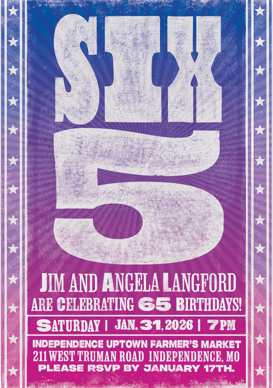
I grew up in Kansas City most of my life. In the 1960’s and 70’s, music and sports were a big part of my life. Album art, concert posters, comic book art and the editorial illustrators Sports Illustrated commissioned back then was mesmerizing for me. I was fascinated by the the radically new lettering styles on album covers and concert posters. I was an avid reader growing up, and the storytelling in the design of classic mid-century book jackets were a big inspiration for me. I was always drawing Band Names and various other “counter-culture” phrases on my school notebooks, as well as making murals on the walls in my bedroom which my parents weren’t too happy about but my friends thought were cool. While art was a part of my life, my time was spent mostly around sports and I didn’t pursue art seriously. I thought my future would involve some kind of sports related profession and I avoided formal art classes until my senior year in high school when I took art as an elective. That’s when I was hooked, particularly around storytelling with illustration. I attended The University of Missouri at Columbia and studied foundational Fine Art there, and then transferred to KU my junior year for their Design program. I started out pursuing Illustration and photography at KU and switched to graphic design my senior year.
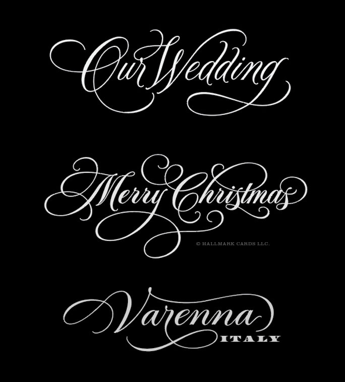
Hallmark Cards hired me right out of KU mainly for the hand lettering in my portfolio because the design work I was showing was a little too “masculine” and didn’t translate very well to their product lines. At Hallmark I worked mostly in the Lettering Department and Visual Studios as an artist, and eventually moved up into the Art Director role in the Visual Studios. Like many designers at Hallmark my original plan right out of university was to stay there for a few years and then get a job working at a small design studio or Ad Agency. However, I discovered working at Hallmark was like being in a top notch Master’s program with world-class talent everywhere. The artists were so open and generous in sharing their skills. Needless to say, I never left and retired in 2025 after 40+ years.
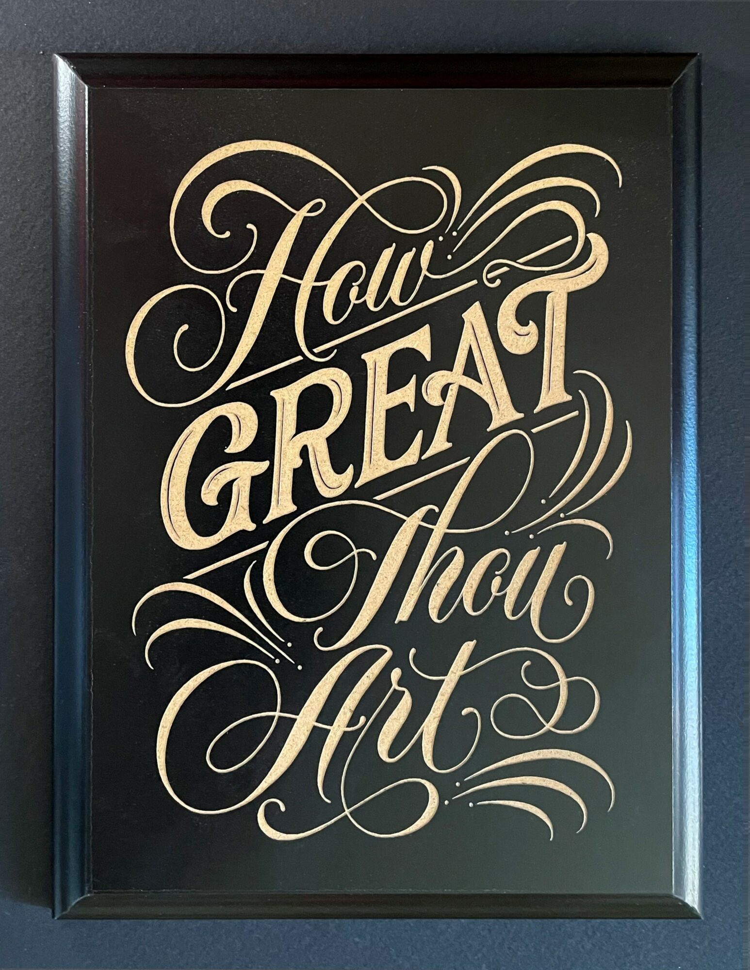
Working totally analog in the 1980’s was an important foundation for the mostly digital custom lettering I do now. Learning the subtleties of how various analogue lettering tools behave (and how to manipulate them) like brush and ink, pointed pen, broad pen, and the principles of hand drawn formal script lettering informs everything I create in the digital space with Adobe apps and Procreate on the iPad. Most of the time I’ll do my sketching and rough lettering off of the computer and scan it in and work on top of those roughs.
I think a few things that influence my work are Letterpress, sign painting, tattoo art, and collage art. I’ve maintained a small but steady freelance design practice on the side over the last 40 years and am now able to focus more of my time on growing that business with my Brand Lettering and Design Studio.
I’m sure it wasn’t obstacle-free, but would you say the journey has been fairly smooth so far?
I think it was smooth for the most part. Design school wasn’t easy. I wasn’t sure if I wanted to be an illustrator or a designer. There was so much talent at both MU and KU when I was there I recognized that I was a better designer than I was an illustrator, and the Design School faculty at KU in the early 1980’s was totally amazing. Starting at Hallmark in the early 1980’s working totally analog before computers, and then gradually transitioning to digital design over the next 15 years naturally had it’s challenges as well, but nothing that couldn’t be worked through. Hallmarks creative culture was impressive and was a solid place to grow creatively.
I suppose one struggle I might have had early on at Hallmark was developing a unique voice for my lettering and design. I was a designer who loved the craft of hand lettering and typographic design, and enjoyed the variety of doing a diverse range of product lettering styles from elegant and sophisticated to bold and graphic, and even the cute and charming styles for kids product lines. Not being known for a particular style was a bit of a career hindrance early on, but for the last half of my career I think having a diverse set of creative styles made me a more valuable designer and stronger Art Director.
I would say my freelance work during those Hallmark years was a big contrast from the greeting card work I was doing during the day. The freelance work was rewarding, but it could be a struggle to squeeze it in at times. We had five kids during the 90’s so I didn’t start on my freelance work during their younger years until they were in bed, which led to a lot of late nights starting work at 9 or 10pm and working until after midnight, and then getting up and going to work designing for greeting cards the next day.
Thanks for sharing that. So, maybe next you can tell us a bit more about your work?
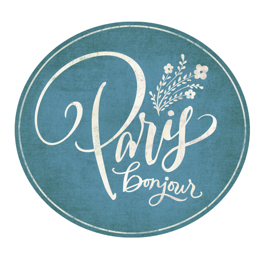
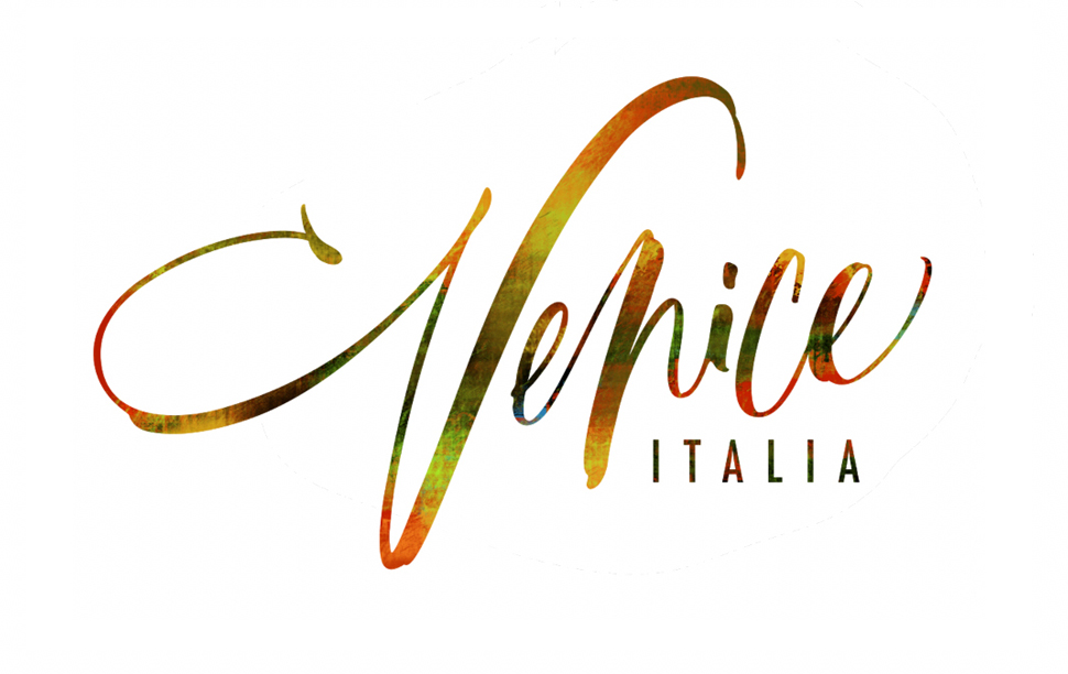
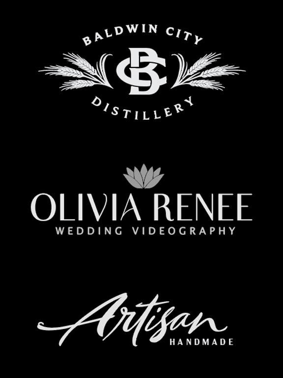
I’m a designer and lettering artist who collaborates with small businesses either at start up phase to tell their brand story, or those needing to strengthen or refresh their existing brand personality. Building a unique visual identity that stands out in the marketplace is an important aspect of what I do. Helping the Baldwin City Distillery’s successful start up with logo development and product label design is recent work I feel really good about. I think one thing that sets me apart is that I specialize in hand drawn lettering and typographic focused design for branding, advertising, marketing, publication design and of course will continue to develop hand lettering stylings for the social expression/greeting card industry when that opportunity presents itself.
I think that refined, elevated modern designs are mostly what I’m known for, but with my Hallmark product background I’m comfortable working in a wide range of styles from playful, bold and graphic, to minimal and sophisticated as well. I think that my ability to develop designs in a wide range of styles are something unique that I offer, especially when it comes to designing solutions using custom lettering. That style range is probably what I’m most proud of, as well as when I’m out at retail and I see my hand lettering still showing up on Hallmark product lines. Like I’d mentioned previously, letterpress, sign painting and collage art have been a consistent area of interest and influence for me. I had opportunities to do some letterpress and collage designing while at Hallmark. Those more traditional creative processes are something I’d really like to spend more time exploring in the future.
So maybe we end on discussing what matters most to you and why?
My Christian faith grounds me. Family relationships are right behind that. I love seeing the wonder of the world through my grandkids eyes, and watching our kids grow in their new roles as parents. Lastly, living an active, productive life is also important to me. I “retired” from Hallmark in 2025 but not from being creative every day. I love the whole creative process and particularly the craft in custom lettering. Bringing words to life and giving them a personality that amplifies the words and helps to tell a unique story, or helps to strategically build a small business identity is important to me. I was blessed to be mentored throughout my career by world-class talent at Hallmark Cards. I can see all of their influences in my work. Giving back and mentoring other creatives the way I was mentored at Hallmark was, and still is important to me.
Contact Info:
- Instagram: https://www.instagram.com/jim.langford/
- LinkedIn: https://www.linkedin.com/in/jim-langford-8b980132/
- Behance: https://www.behance.net/jameslangford5